We are a web and mobile design, development, and digital marketing agency. Request a Quote
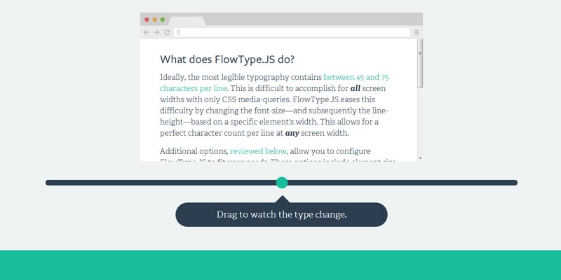
Flowtype is a responsive typography solution for your web page or web app. Flowtype is a jquery plugin that comes with a single javascript called flowtype.jQuery.js which is light in weight for your web project. Flowtype simply enhance and keep maintain aspect ratio of font size and line height of the content irrespective of display dimension variations.

Flowtype is a fully responsive typography that means it automatically adjust or re-size font size and line height of a web content within block or container in different display devices like desktop, laptop, mobile, table or phablet etc.
|
[button color=”red” size=”small” link=”http://simplefocus.com/flowtype/” target=”blank” ]Demo[/button] |
[button color=”red” size=”small” link=”https://github.com/simplefocus/FlowType.JS/archive/master.zip” target=”blank” ]Download Source[/button] |
[button color=”red” size=”small” link=”https://github.com/simplefocus/FlowType.JS” target=”blank” ]Fork at Github[/button] |