We are a web and mobile design, development, and digital marketing agency. Request a Quote
In this post I am going to cover a beautiful morphing transition effect that is base on CSS and Javascript and fully supported by modern browser like Safari, Mozilla, Chrome and Internet explorer.

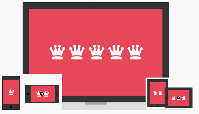
This pretty good demo shows how this morphing effect can resize the user screen according to the different devices like desktop, laptop, tablet and mobile.
The basic idea is to create transition between different devices that show a screenshot of a responsive website or app by applying a “device class”. By using the same elements and pseudo-elements for all the devices, we can create an interesting morph effect. We will control the classes and the switching of the image with some JavaScript. We’ve also added an option for autoplaying the slideshow and for rotating some of the devices.
|
Demo |
Download |